People can sense carelessness, even when they cannot see the code
People can sense carelessness. They cannot see the code, but they notice when something feels rushed or stitched together without thought.
Based on my February 2026 Next.js Melbourne talk about care, craft, and product quality.

Care is visible in the finished product
You can sense carelessness. You cannot see the code, but you notice when a page is slow to settle, when the copy is vague, when a form makes you guess. You are reacting to the experience, not inspecting the source.
AI raises the floor, but it can flatten the result
AI makes competent output fast. It also makes it easy to stop too early and ship the first plausible version: something that works but feels generic.
- A fast draft is not a finished product.
- Generated interfaces need more editing than most teams expect.
- The closer a product sits to the user, the more obvious careless details become.
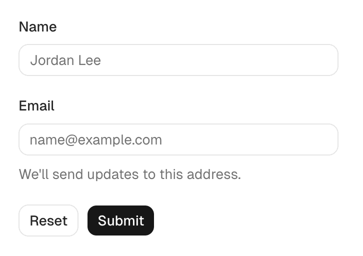
What care looks like in practice
Editing. Cut the awkward steps, rewrite the vague copy, tighten the motion, simplify the hierarchy. And be honest about where AI helps: it is great at momentum, less reliable at deciding what should matter most.
Fingertip after the MVP: a series of 1,000 small iterations
At Fingertip, care was deliberate improvement after the MVP shipped. Each change was small. Together they changed the whole thing.
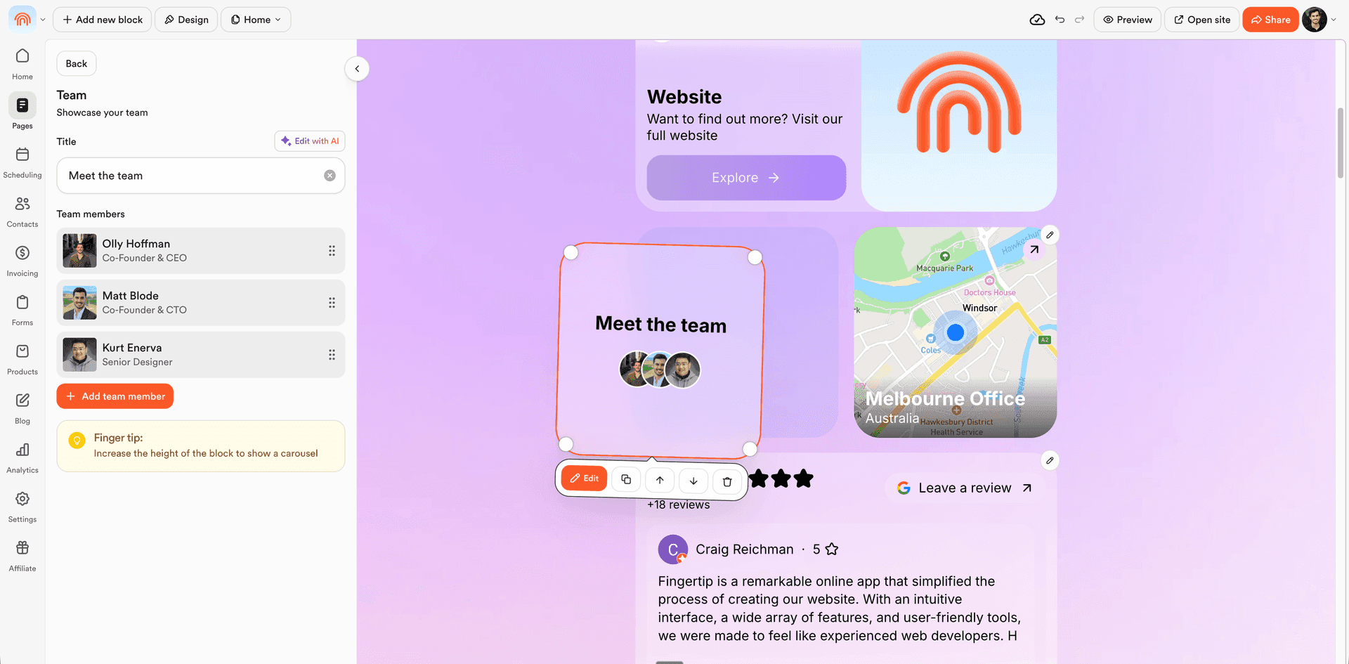
Static list to drag-and-drop grid
The page editor was a static list. We replaced it with a drag-and-drop grid, giving users real control over layout.
Sharing that matches reality
The default share preview was the Fingertip logo. We swapped it for a live screenshot of the user's page via a headless render API.

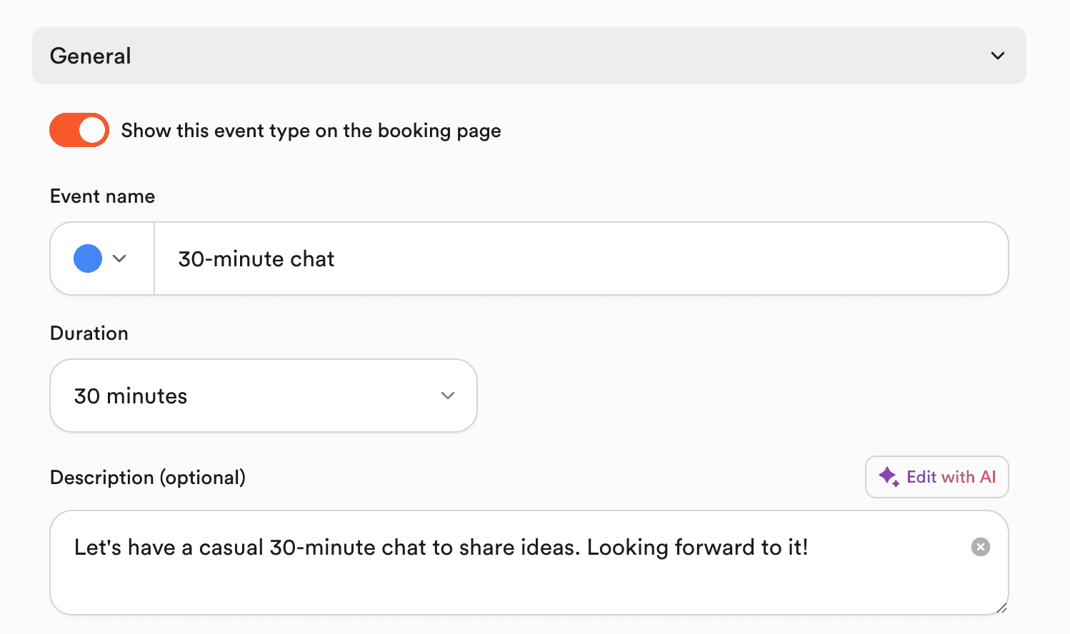
Default shadcn to intentional system
Central icons, custom typography, taller inputs, and a curated colour palette turned default shadcn into a considered design system.
Why this matters to me
My work sits between product, engineering, and design. VenueSafe under time pressure, Fingertip growing into a broader SMB platform, LinkApps at Linktree: the question stays the same. Does this feel right to the user?
It is not about perfection, or polish for its own sake. Just enough care that the product feels deliberate.